In this post, we will be exploring 6 logo design concepts to consider for your mompreneur business. It is imperative to have a brand that shows everyone out there that you mean business, and with the right logo, you can do just that. With a strong logo, you can attract new customers to your mompreneur business, gain brand recognition, and build trust among your audience. With the right logo your business can expand into something remarkable. When it comes to modern logo design ideas, there is plenty that you can do to create a logo that is memorable and relevant to your brand.
Creating a business logo that is one-of-a-kind is essential, particularly when you are in a market with expanding and steady trends. Originality is key since it helps prospective clients to distinguish your business from other businesses.
Before you start the designing process of your logo, first check out your competitors and pay attention to colors, fonts, and symbols that they are using to expand their brands, and think about how best to leverage them when designing your logo.

5 Characteristics Of A Great Business Logo
Simple – Easily understood and identified
Dependable – scalability and flexibility are vital
Timeless – it must be ageless and remain strong despite changing trends
Memorable – it must be distinctive so that it is easily remembered
Thoughtful – every detail of your logo must be considered and used to efficiently symbolize the usefulness and quality of your business
6 Logo Design Concepts To Consider For Your Mompreneur Business
Using a Triangle
Triangle business logo designs tend to be more noticeable in a crowd. Where square logos symbolize structure and circular logos symbolize unity, a triangle logo offers more spirited geometry which can make for an eye-catching logo. Triangles are associated with stability. Just think of fulcrums, steel trusses, bridges, and seesaws. They are all unwavering structures because of their triangle-shaped geometry. Eminent brands like Delta, CAT, and Chevron have triangle shapes in their logo to signify stability, direction, and novelty.
Triangles offer a little more bendability in design which is not the case with other shapes. By simply changing a triangle’s orientation, you can get a completely different feel, meaning, and look. An upward pointed triangle often connects better to power and masculinity, while an inverted triangle better resonates with motion and femininity.
Using a Circle
Circles are highly-recognisable and safe shapes. They symbolize stability, unity, and wholeness. Because they are the shape of the sun and earth, they are also associated with nature and the planet. They are also useful to use as monograms or symbols in a logo, or the framework where your whole logo lives. For instance, the Starbucks logo is instantly recognisable with its mermaid figure inside a green circle.
Choosing a Logo That Has Meaning
Your logo must convey your brand message. Consider what you want people to think when they look at your logo. Must it be self-explanatory? Also think about your target audience. Your logo must communicate who you are, what you do, and how you can help them. With a logo that lacks meaning, it will be tricky for users to become loyal to your brand, particularly if they are bombarded with promotions and advertisements in plain sight each day.
Choosing Typography Wisely
One of the most essential aspects of a great logo is typography. Without proper typography, it is highly likely that your logo will not meet expectations once you start introducing marketing campaigns. Choose a font that best embodies your brand without using options that are difficult to read, not spaced properly, or merely unflattering.
Using Abstract Shapes
You can attract prospective clients by using abstract shapes that are engaging and unique, while allowing your business to stand out among the rest. Design shapes that are original, trendy, and even non-traditional can give your brand authenticity and a fresh look. Don’t copy shapes and patterns from other successful brands and rather create something that you can call your own and that reflects your business the best.

Choosing The Right Colours
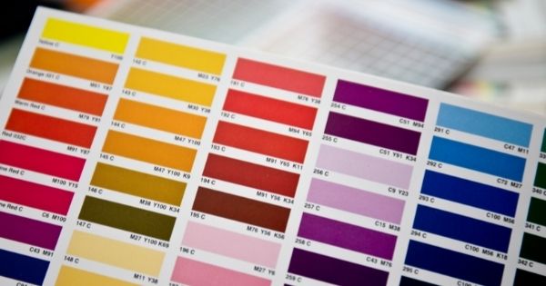
Selecting the right colours for a brand and logo is detrimental and understanding colour psychology and theory can be highly beneficial to keep visitors interested in your brand and what you can offer. Different colours have different meanings.
- Blue is mainly used for promoting corporate appeal, connectivity among users, and professionalism.
- Green signifies environmentally friendly businesses and banks, ideal for businesses that promote shopping in retail environments.
- Red stops people in their tracks and is regularly used for expensive luxury advertisements and promotions.
- Purple offers elegant appeal and is the colour of royalty.
- Yellow and Orange are symbols for promoting happy, engaging, and healthy milieus. It also symbolizes creativity.
- White/Black is ideal for brands that prefer a minimalistic approach or ones that represent high-end extravagant products.
Conclusion
I hope these 6 logo design concepts to consider for your mompreneur business have been useful and that you will consider some of them when you are designing your business logo.
 Kaboutjie SA Mommy Blogs by Lynne Huysamen


